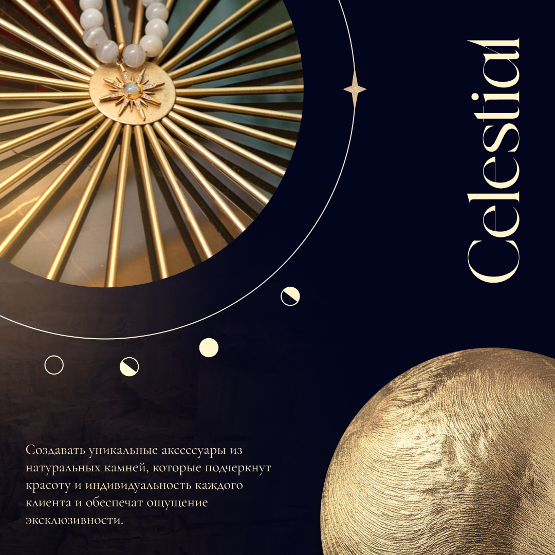
CELESTIAL
Art Direction · Graphic Design
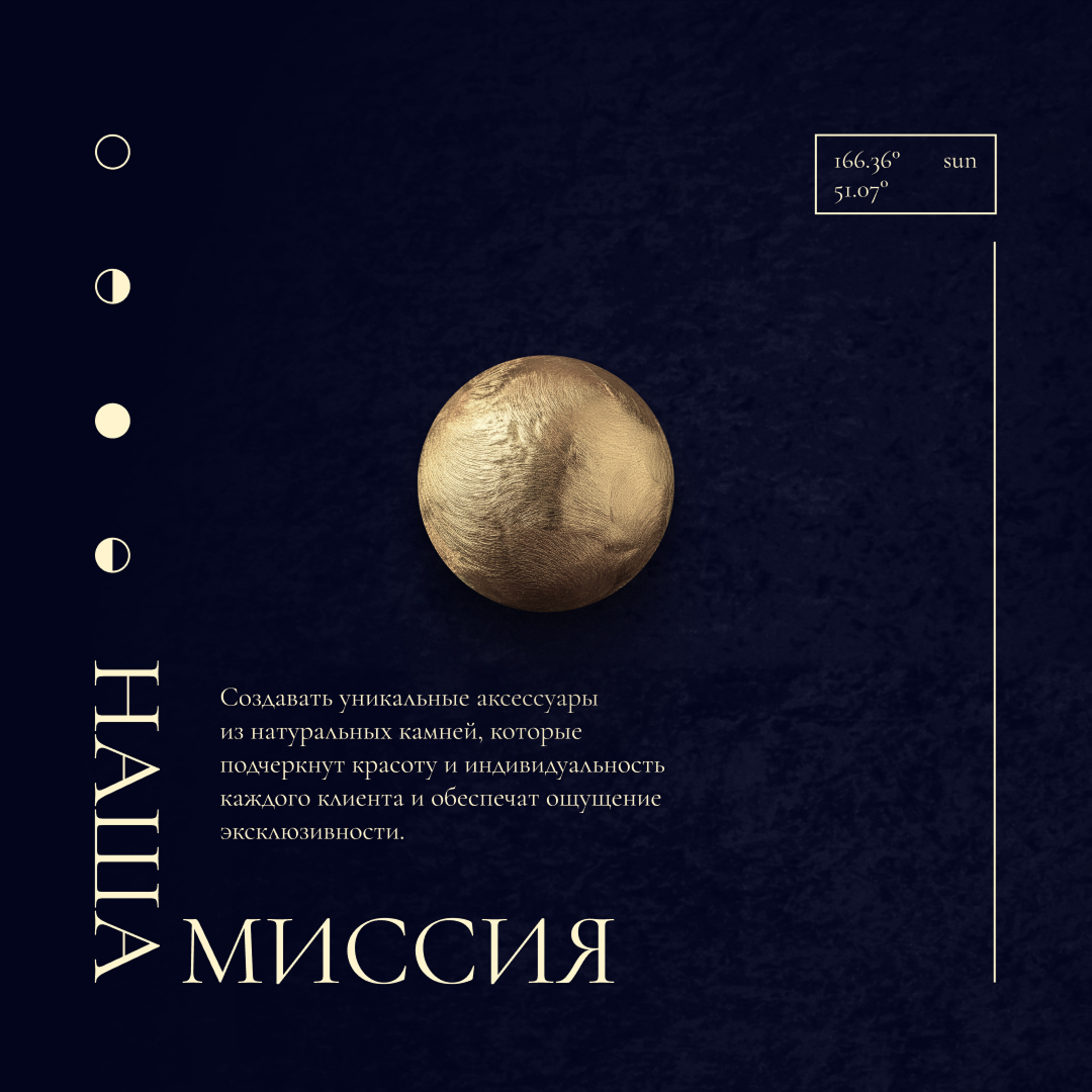
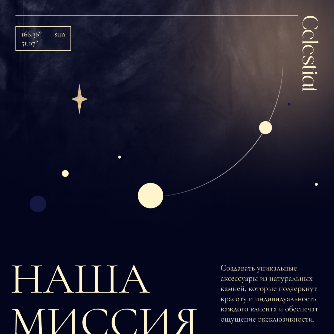
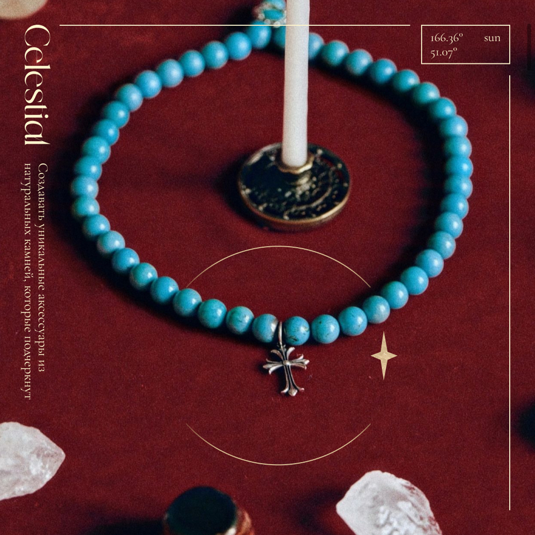
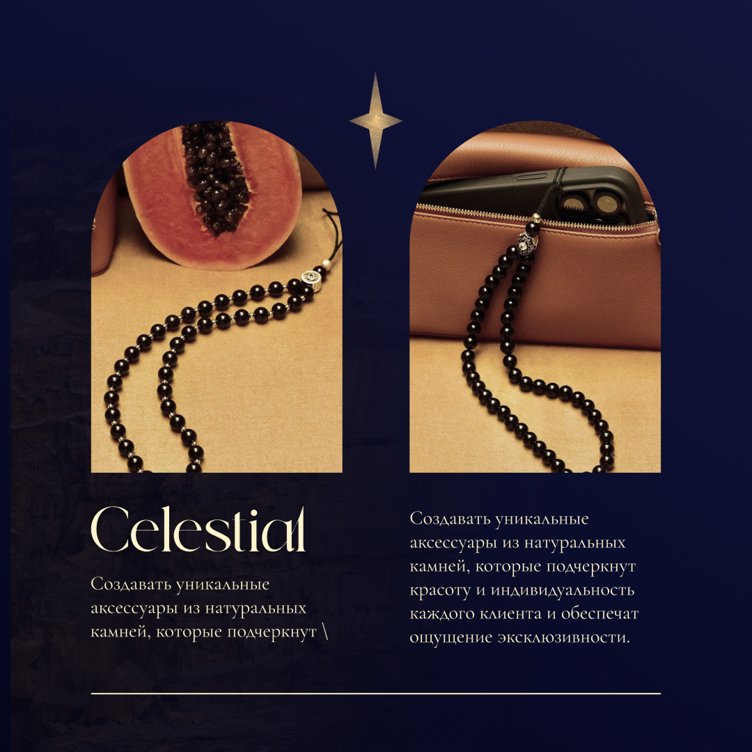
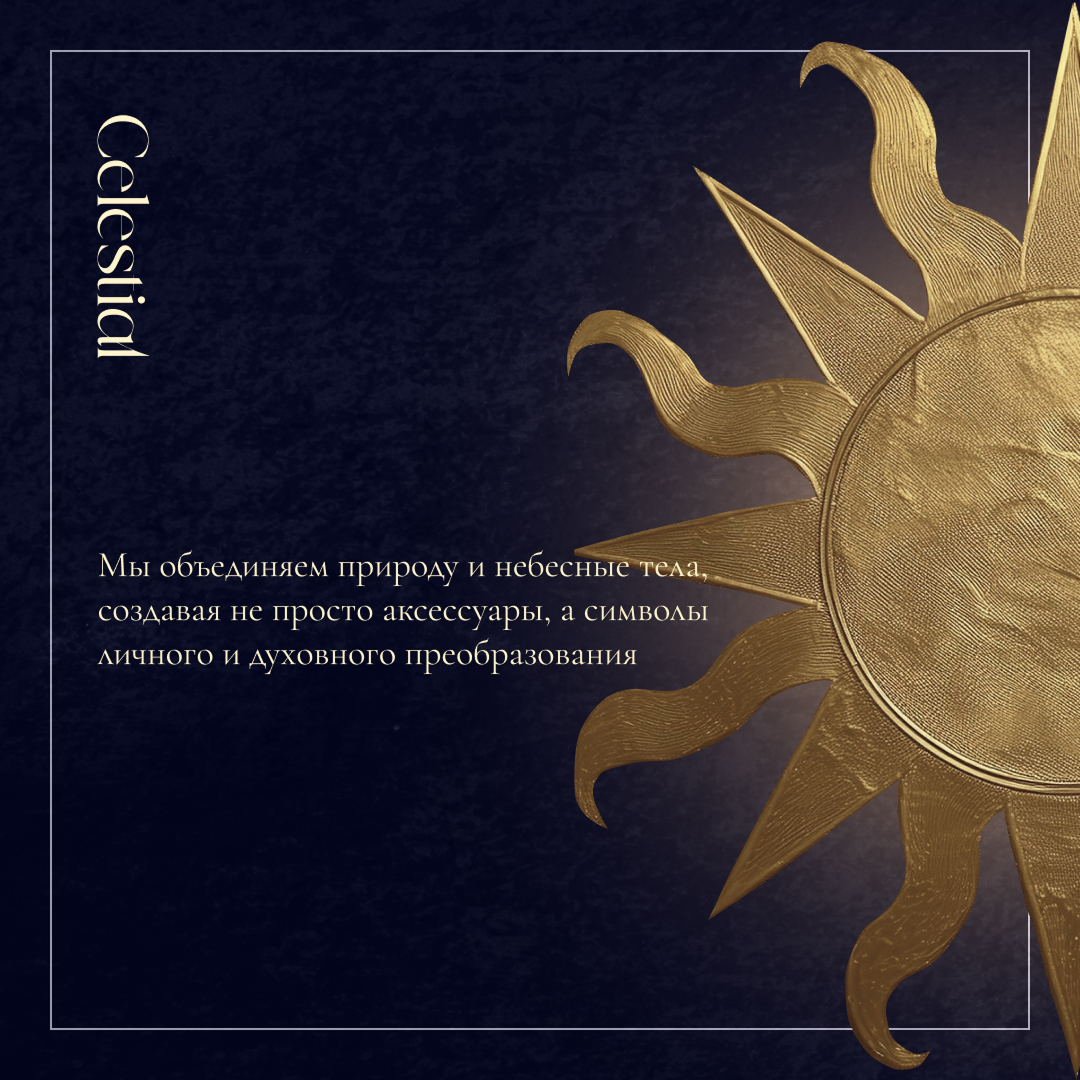
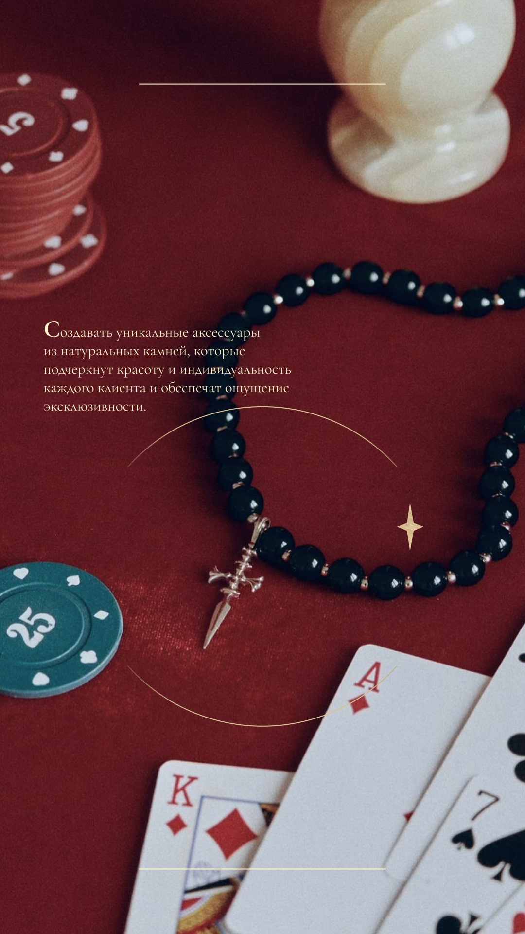
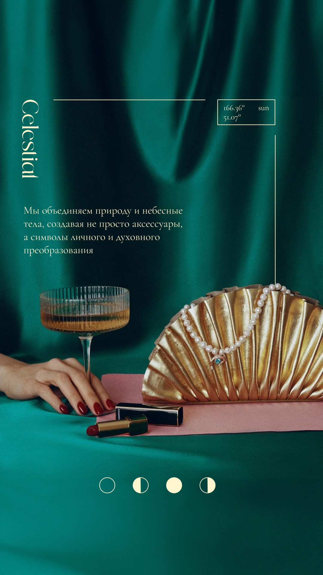
Celestial — a handcrafted jewelry brand where each piece is conceived as a symbol of personal and spiritual transformation.
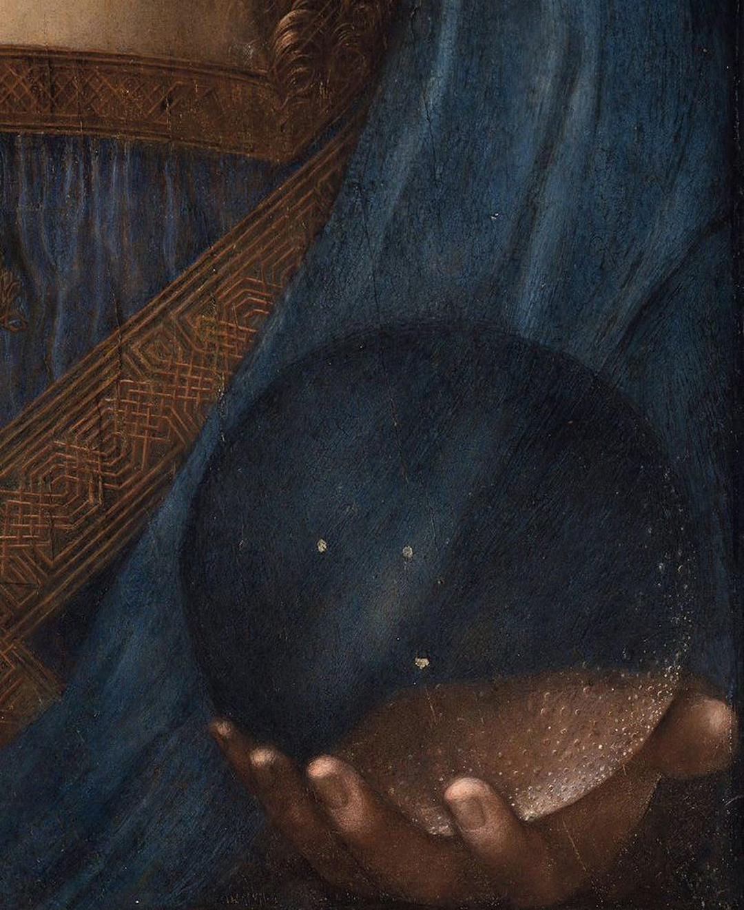
Rooted in the ancient belief that stones are connected to celestial bodies, the brand draws from alchemy — a philosophy centered on transformation, harmony, and the pursuit of something eternal.
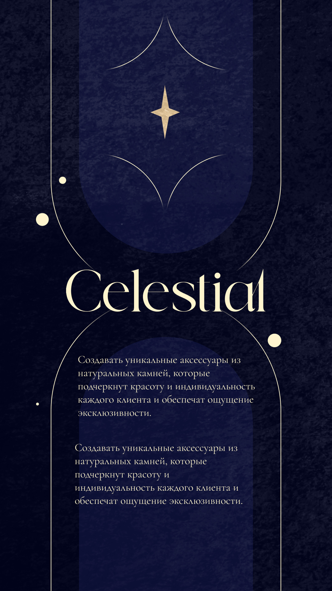
Two marks.
One world.
The logotype system operates across two registers — a primary wordmark anchored in the brand name, and a secondary symbol. Together they form a flexible identity capable of expressing the brand across every touchpoint.
Garamond

Mysticism.
Alchemy.
Transfor-
mation.
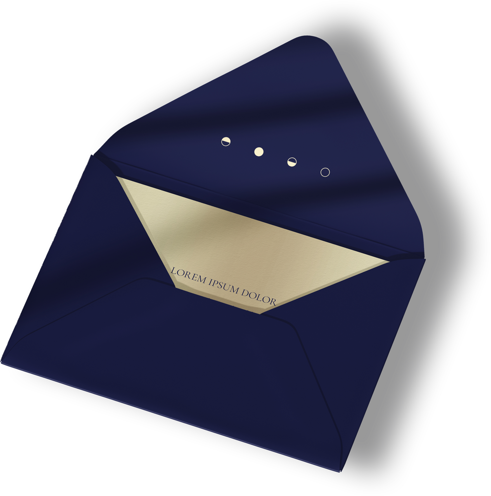
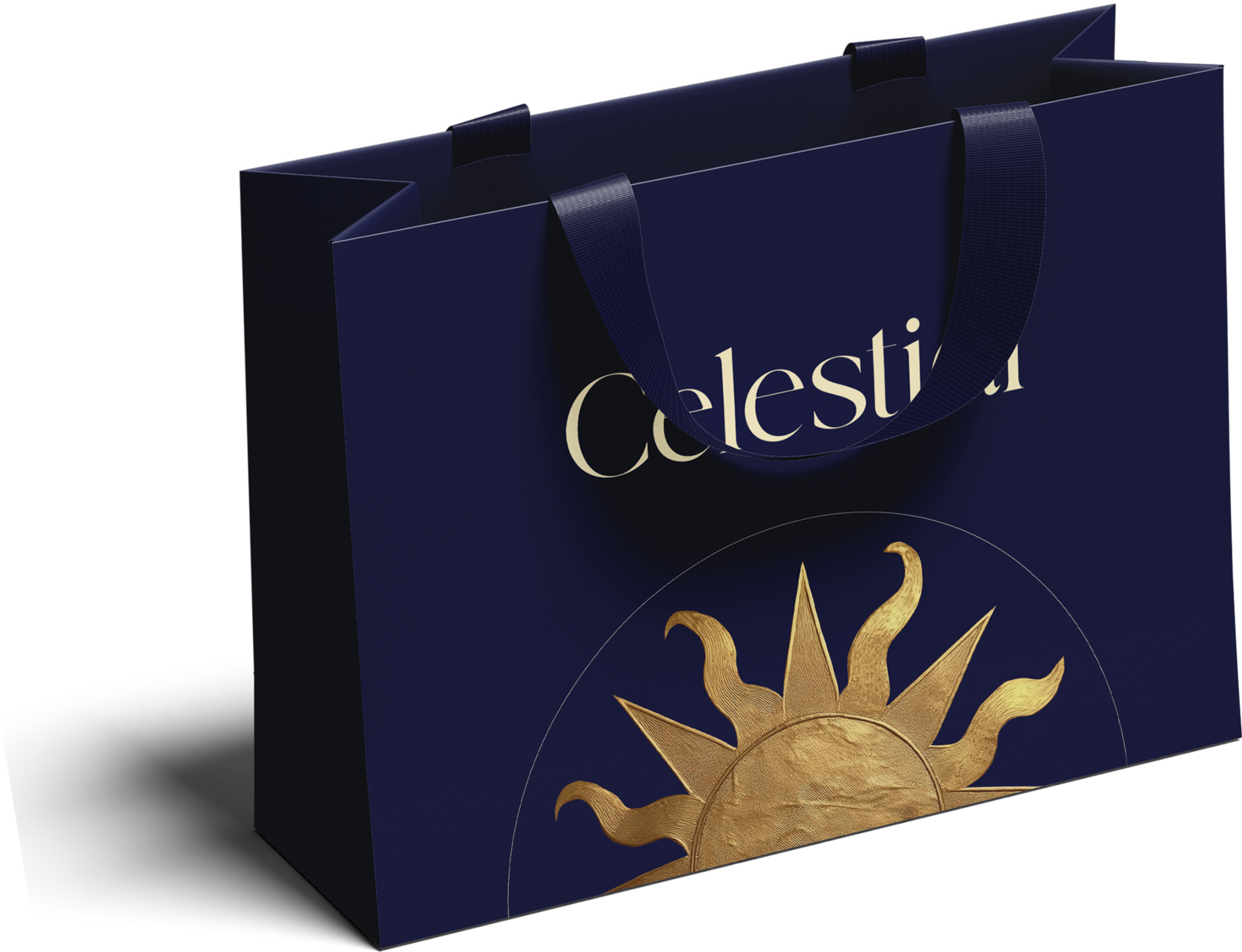
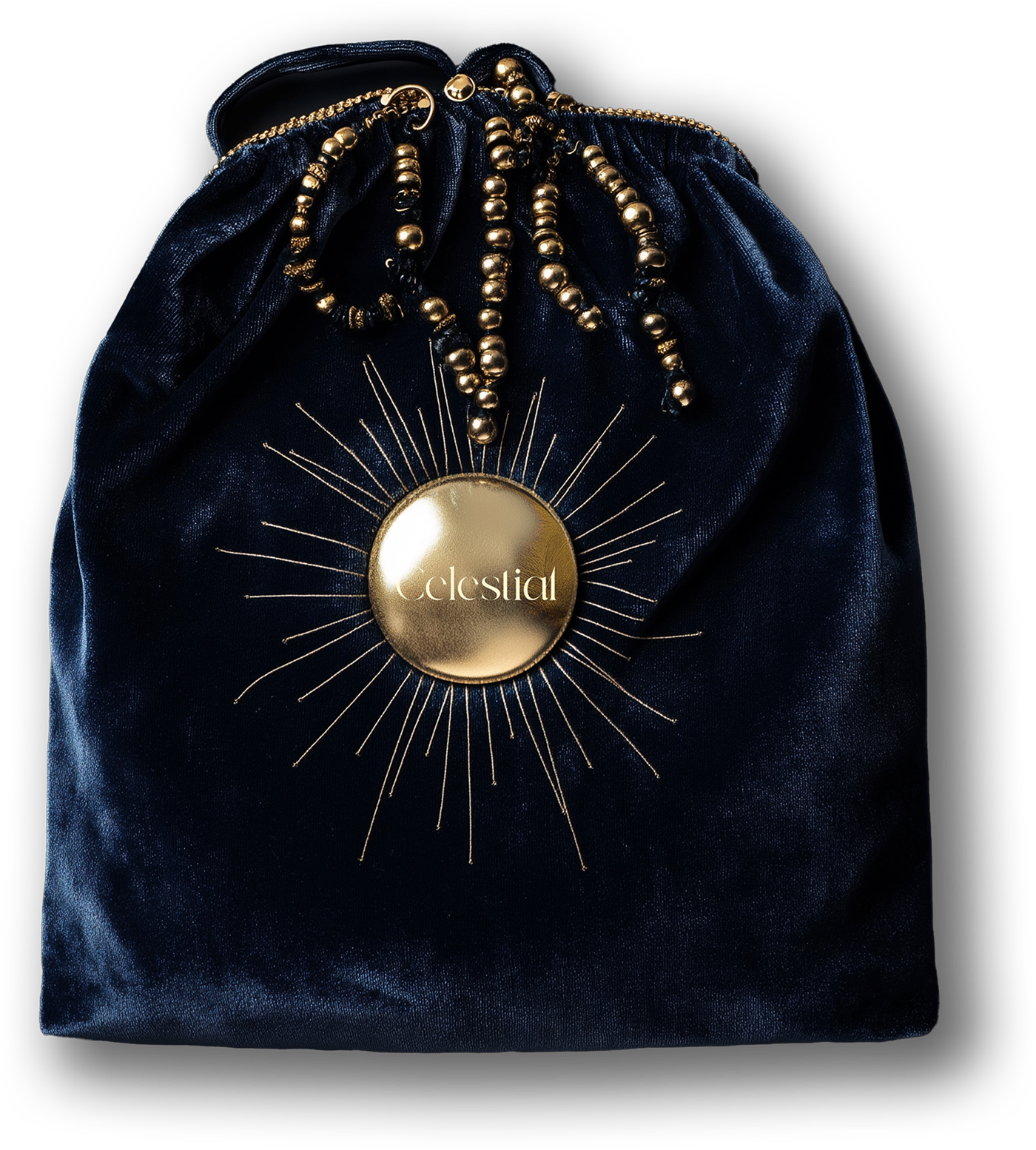
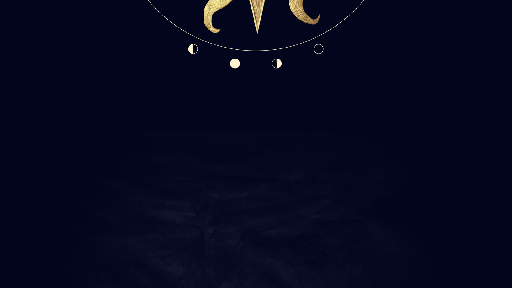
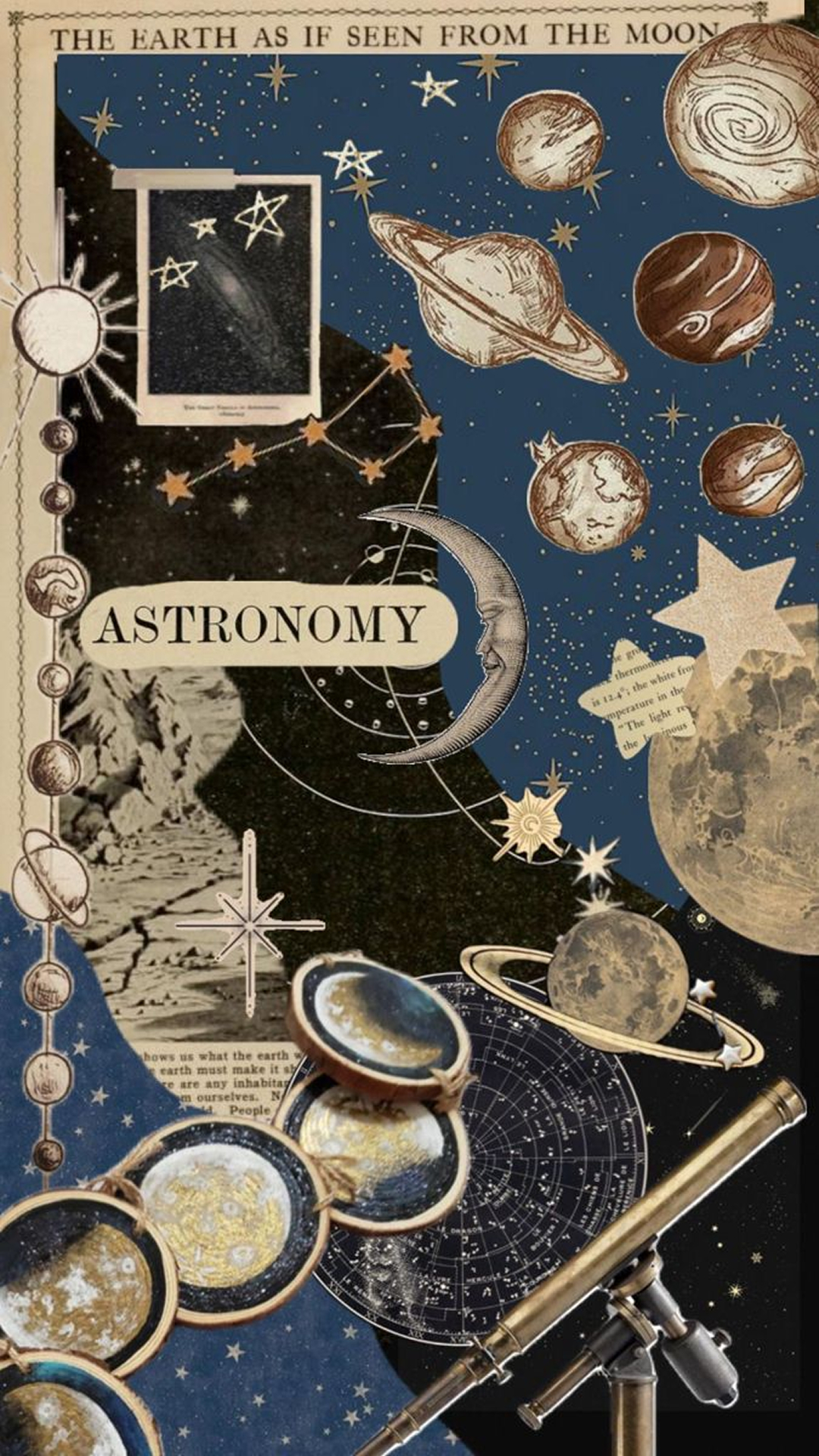
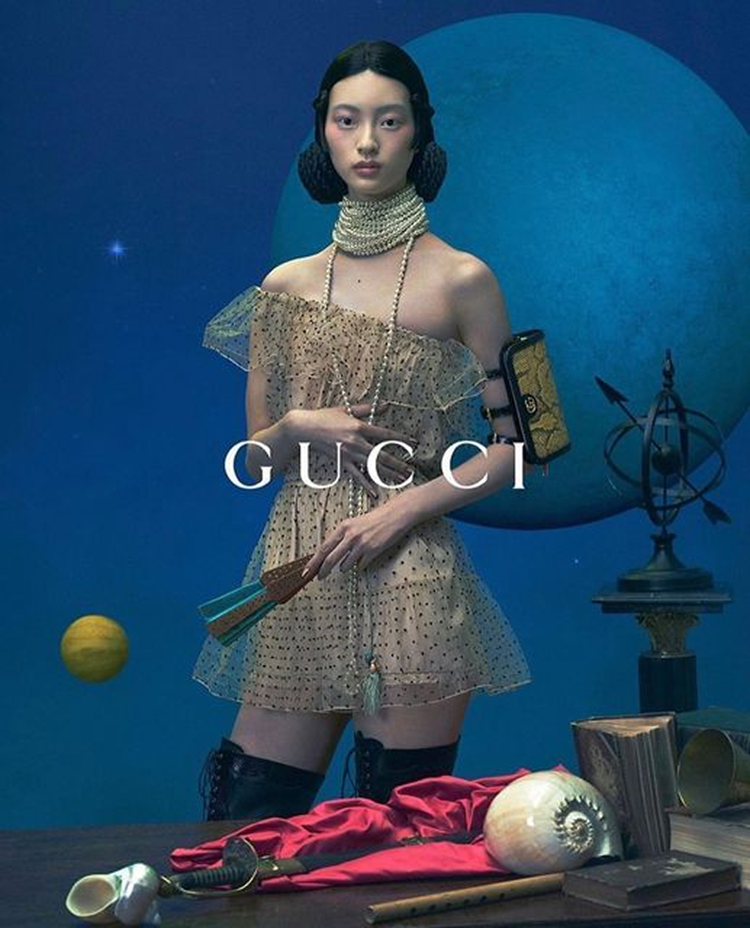
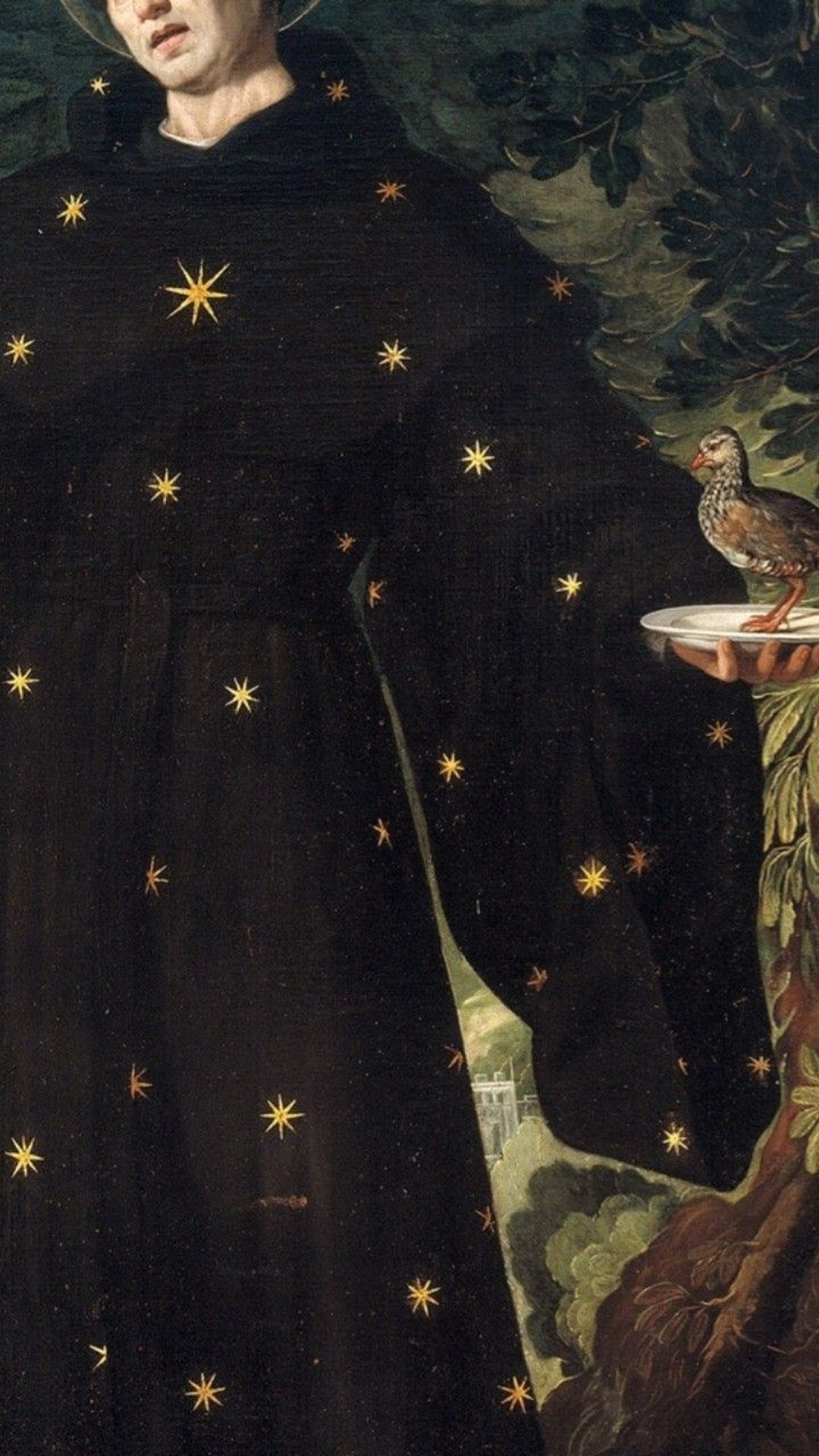
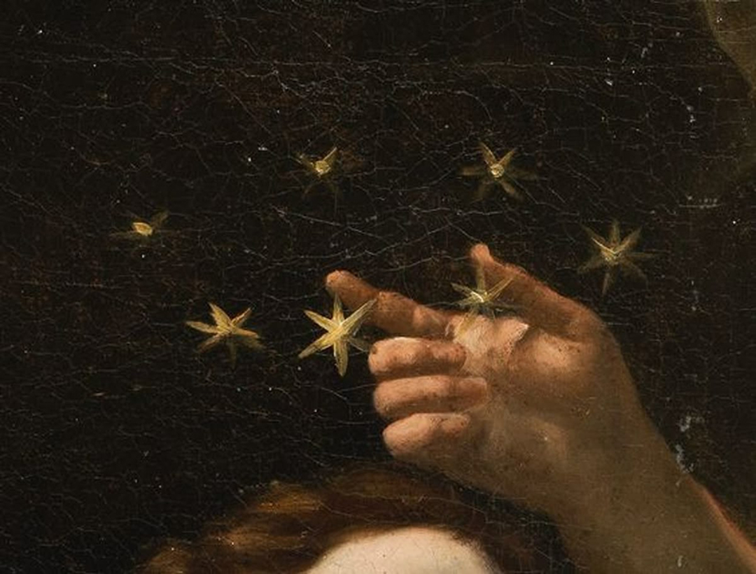
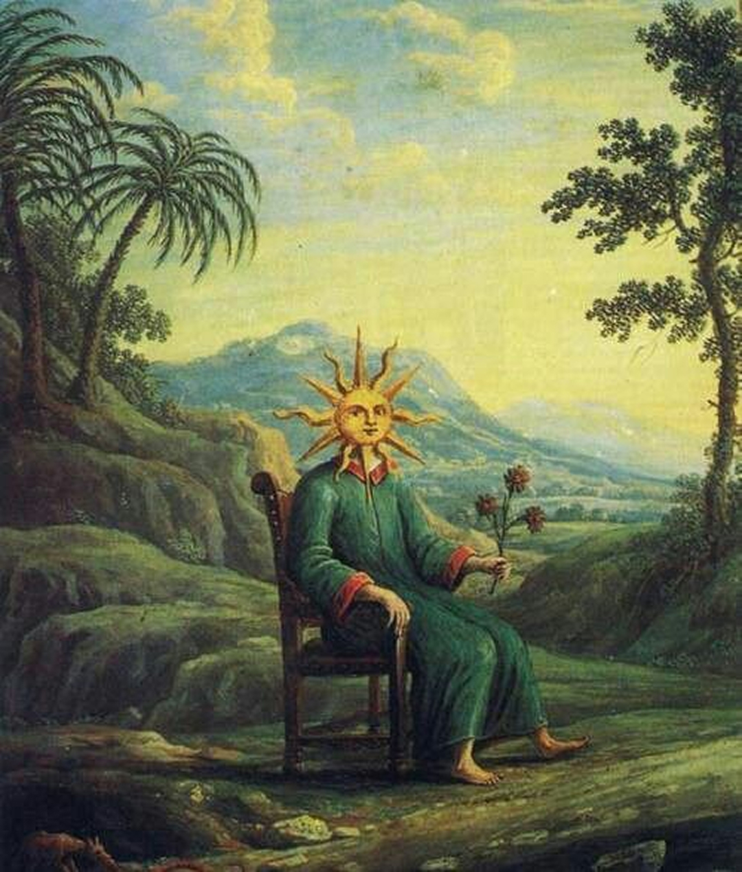
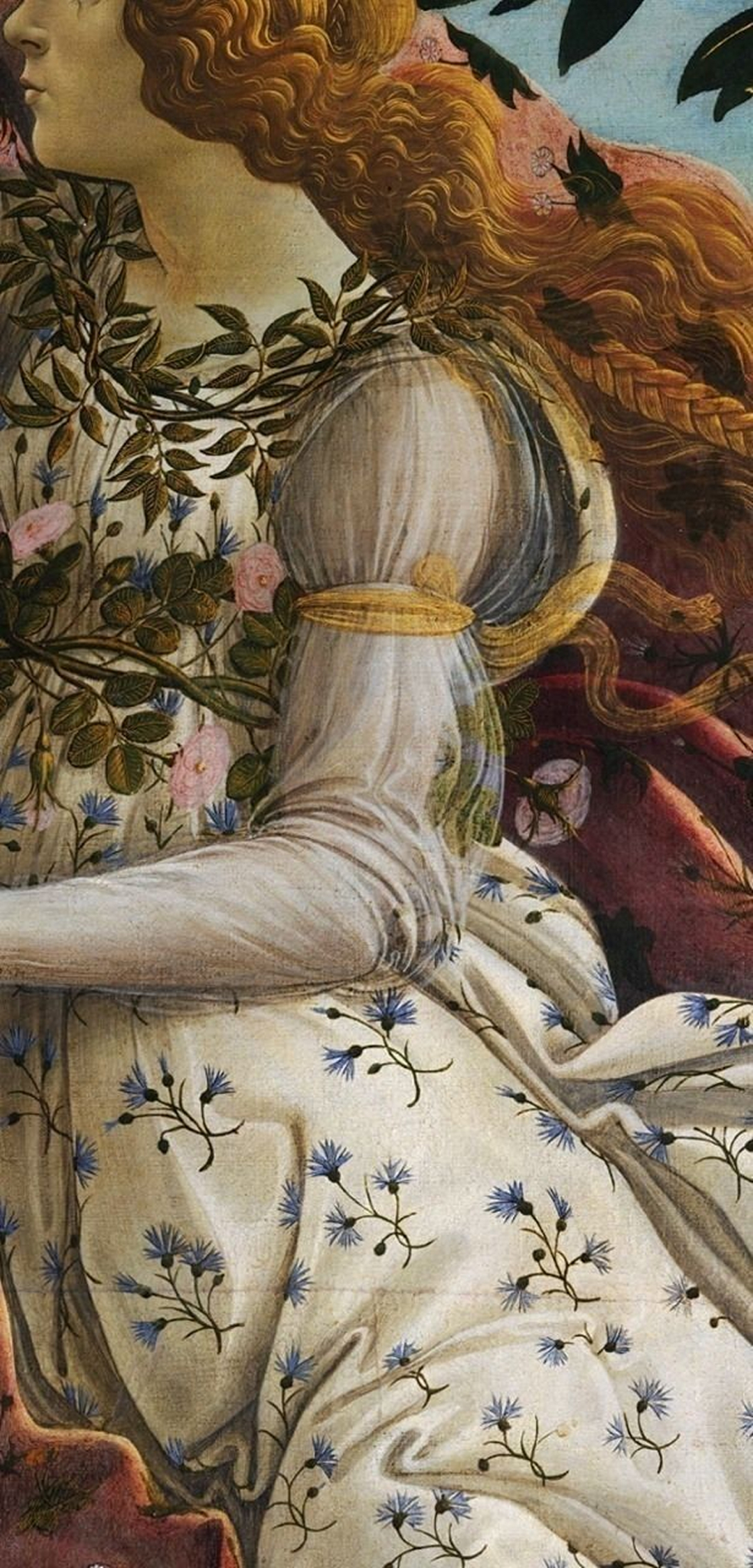
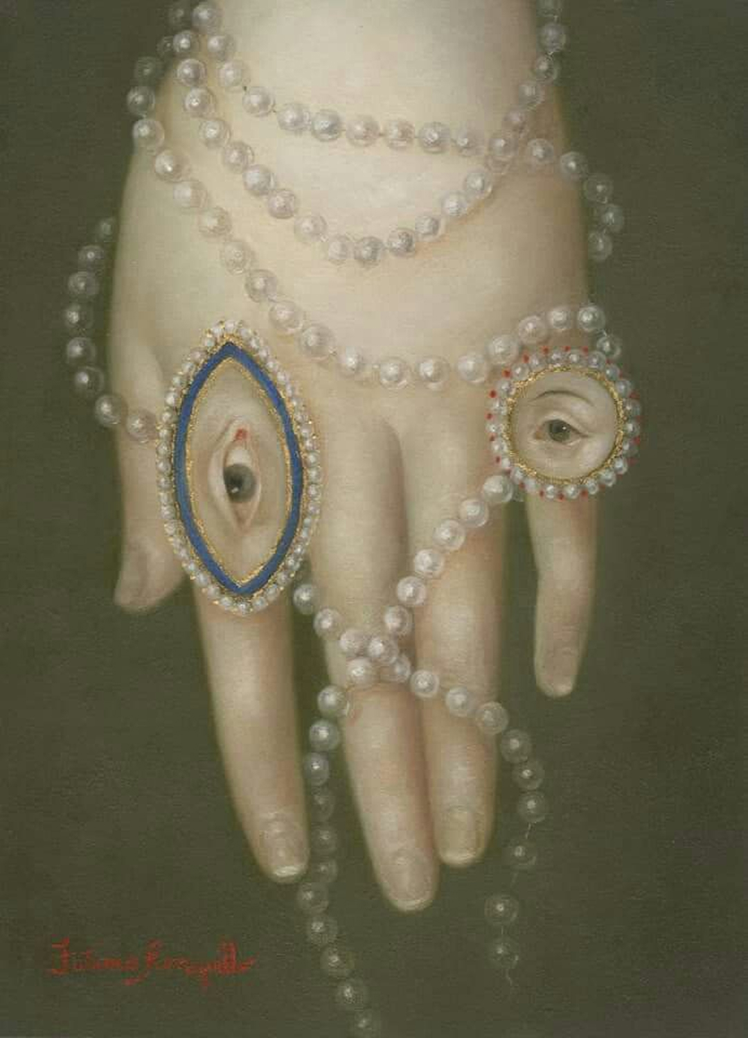
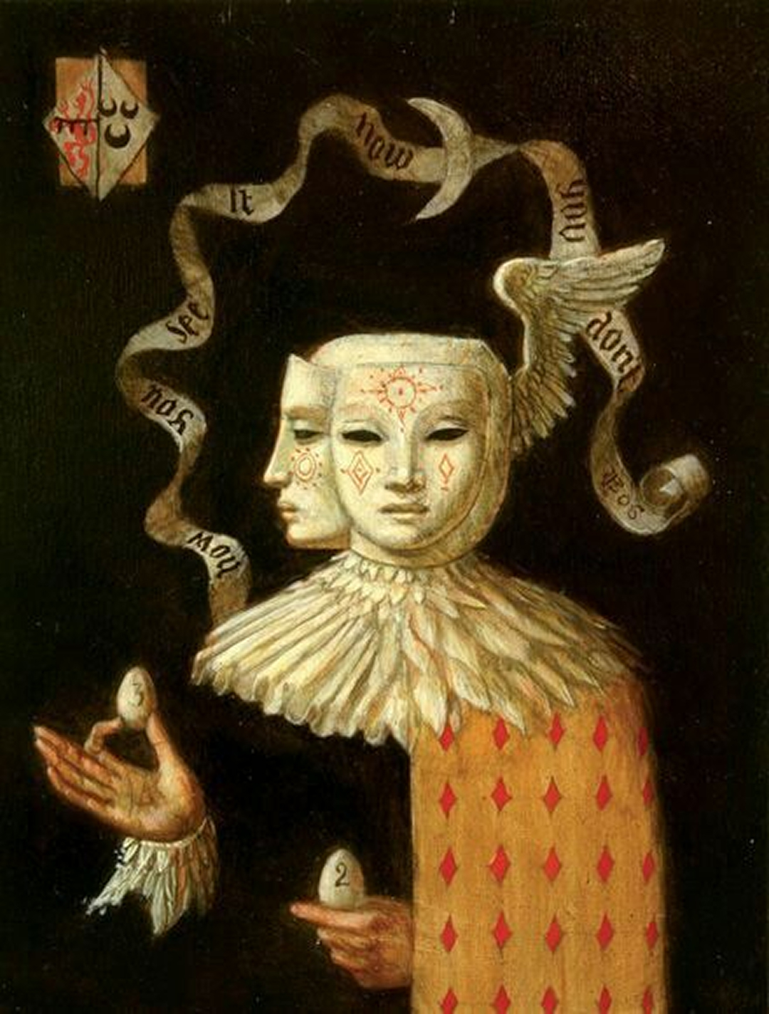
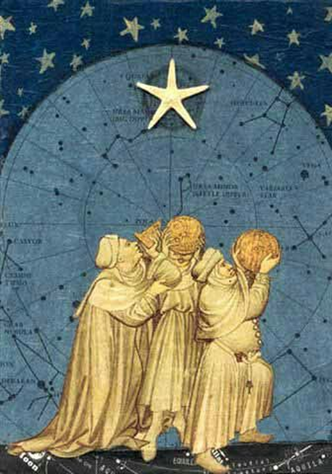
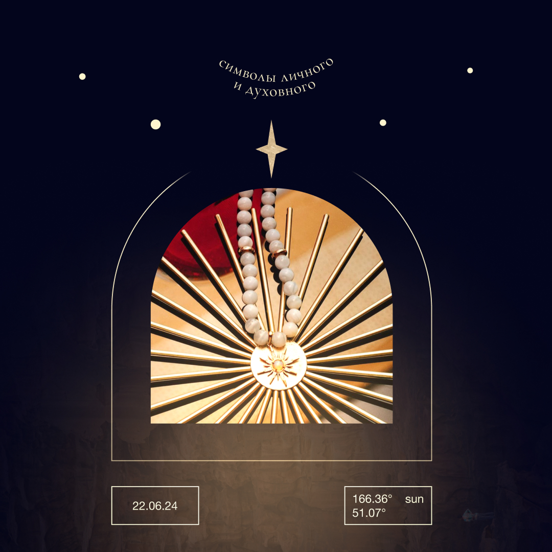
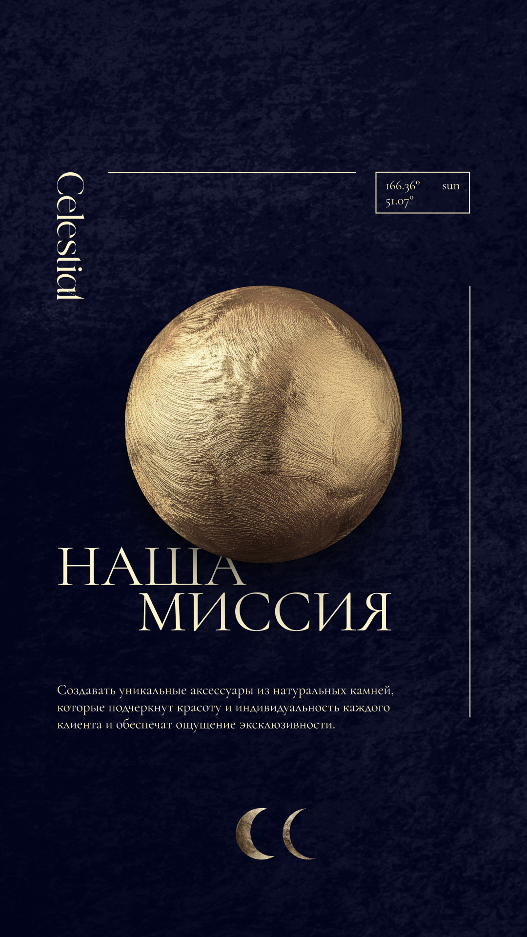
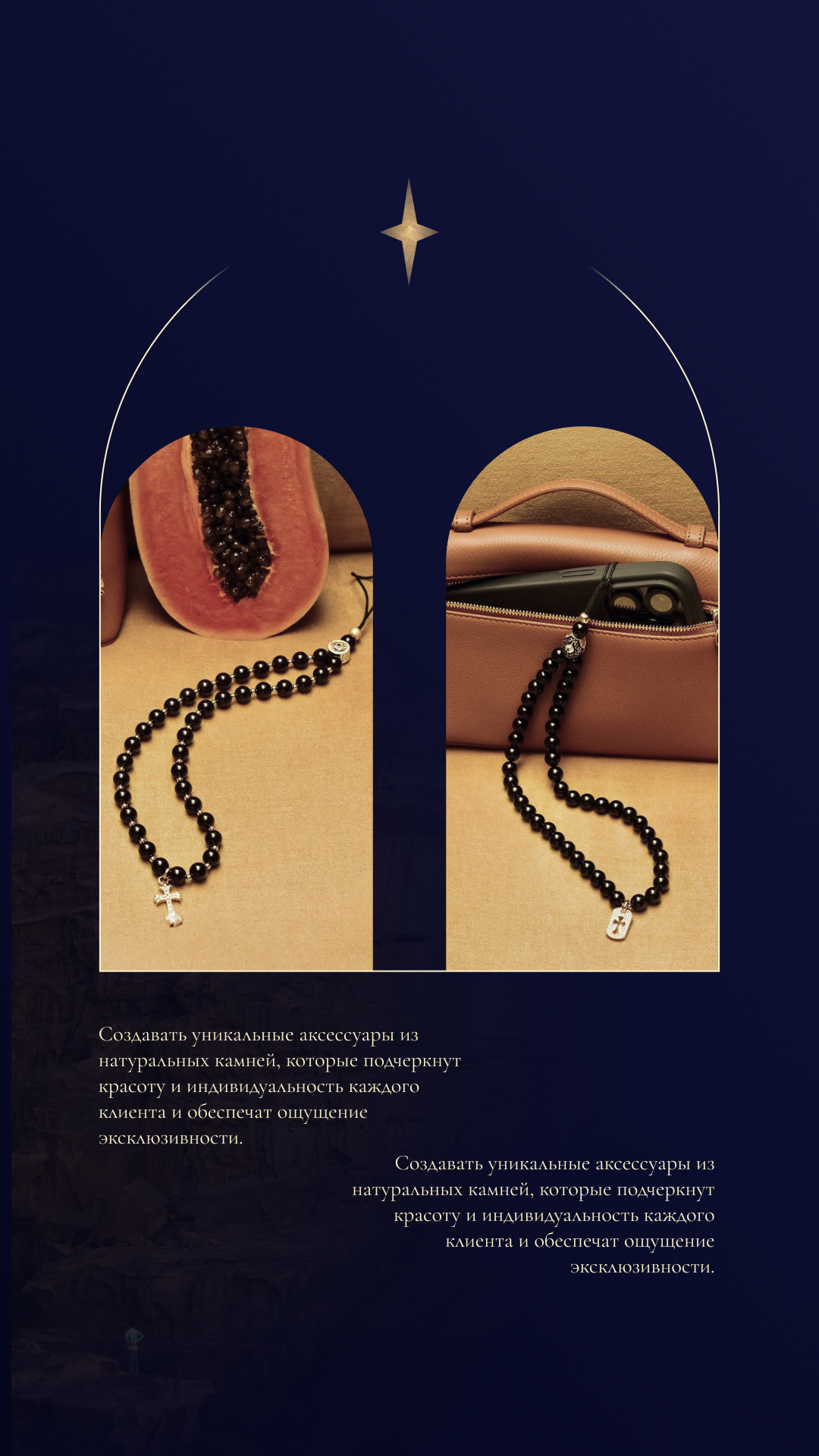
The visual identity is built around the Sun and Moon as key visual archetypes, supported by symbolic patterns and abstract graphic elements. AI-generated imagery creates surreal compositions integrating jewelry into narrative, otherworldly scenes.
A central idea is Opus Magnum — "The Great Work" — an alchemical concept representing creation and transformation. Visual inspiration comes from early 20th-century mystic publications and illustrative luxury references.

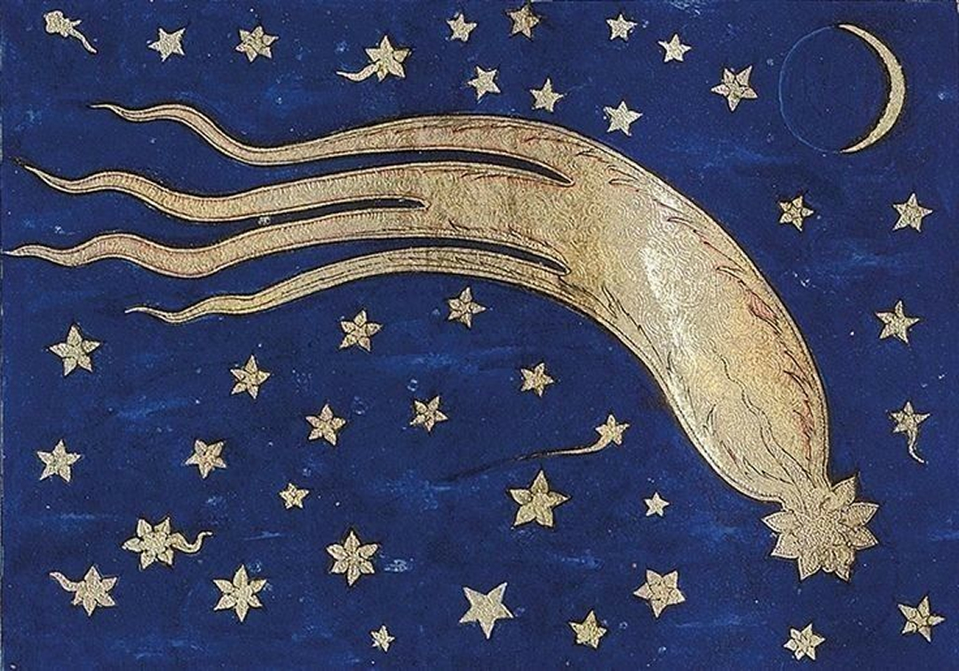
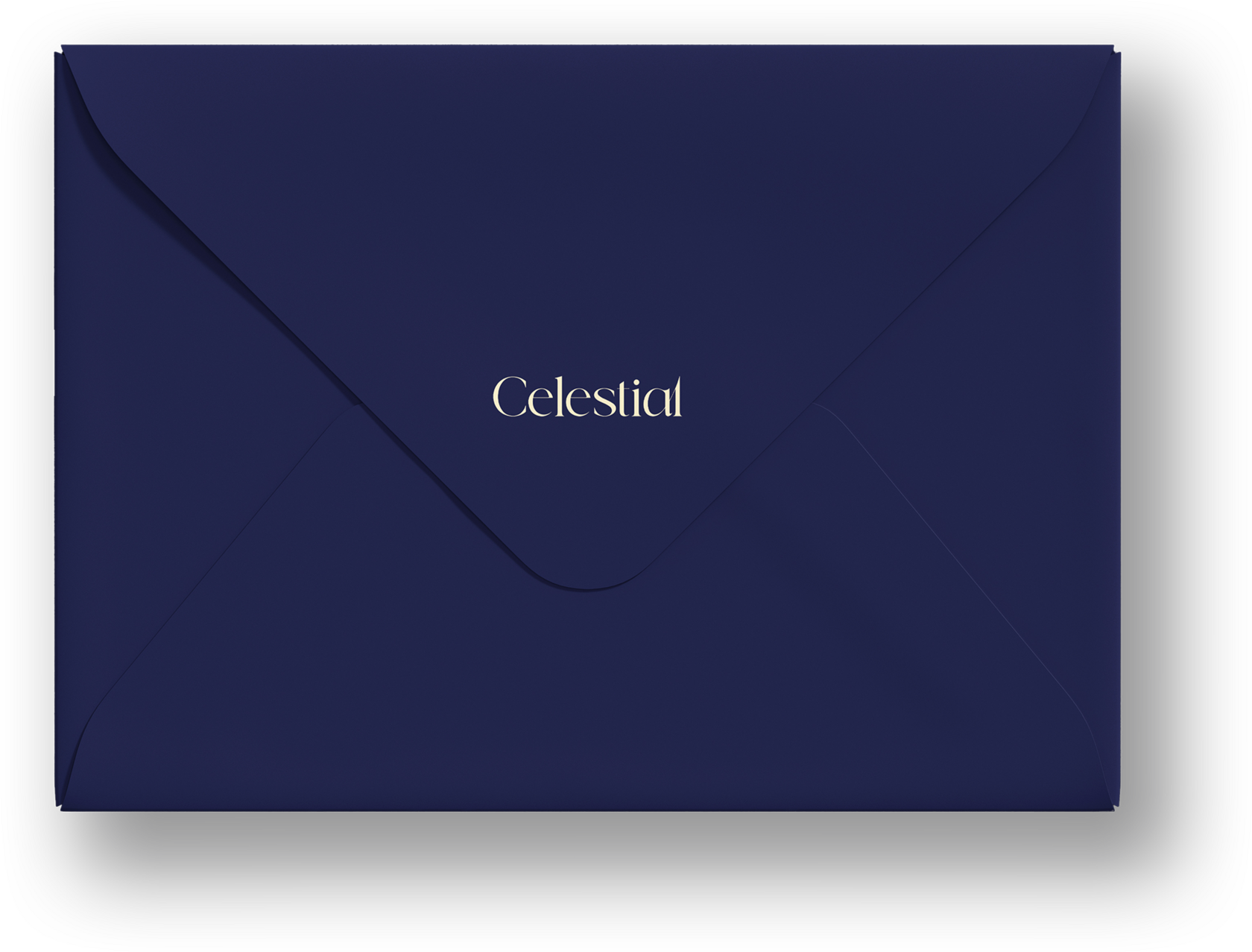
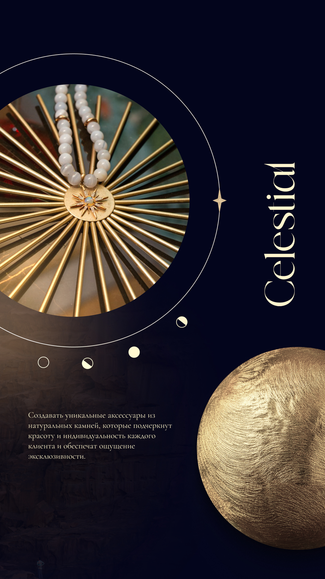
Dark blue.
Lemon cream.
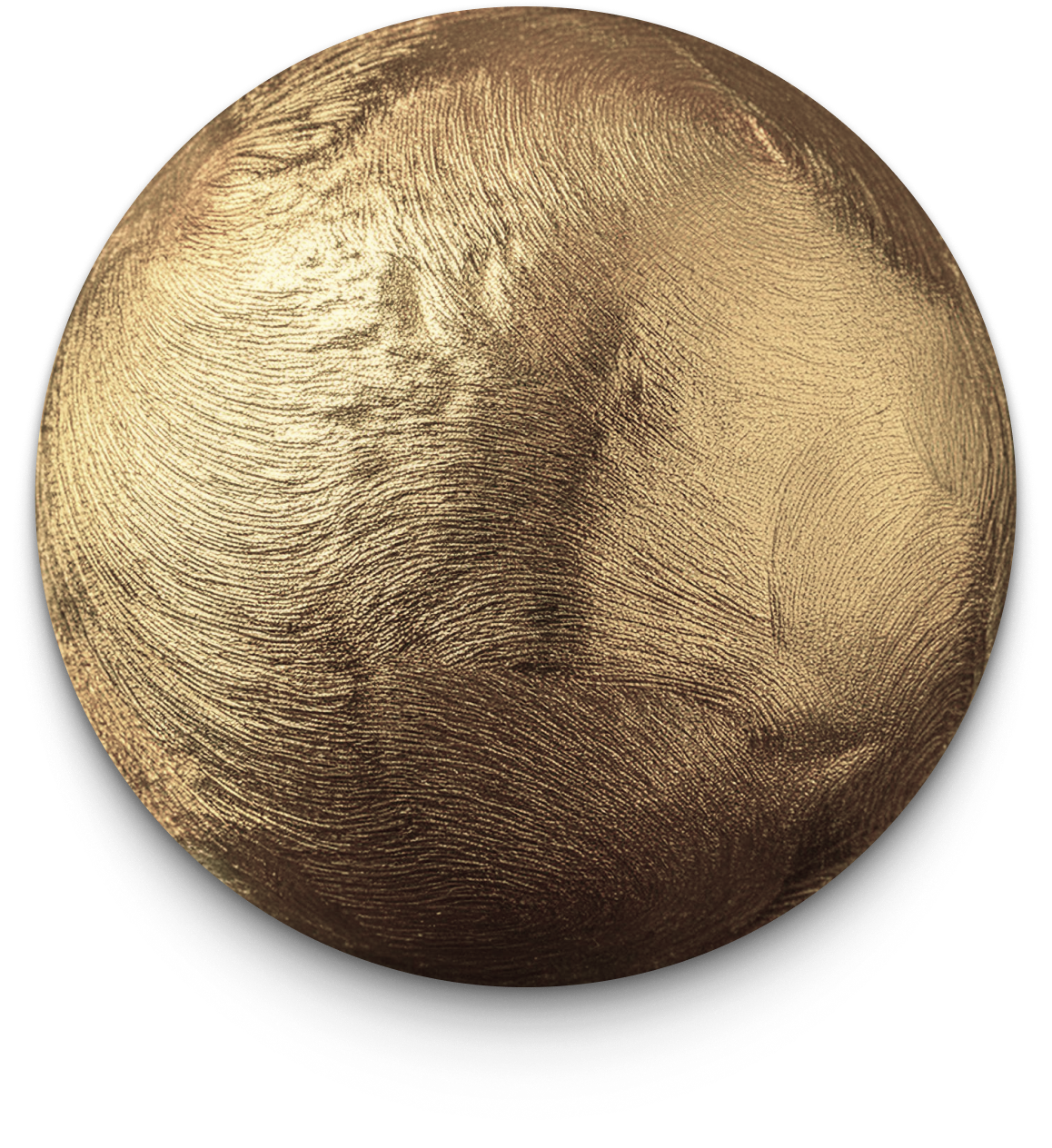
Metallic gold.
Deep dark blue as the core base, paired with lemon-cream and gold-yellow accents. Graphic elements designed to feel tangible and textured — almost physical. Rather than flat digital shapes, the visuals reference real materials: metal surfaces, fabric textures, sculptural forms.
What exists digitally is mirrored physically — from screen to object. Typography and graphic symbols work together to balance elegance and mysticism, resulting in a brand system that feels timeless, immersive, and quietly powerful.


Every detail
considered.
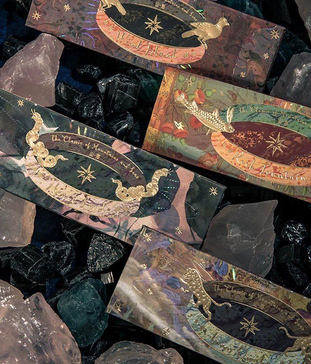
The brand system extends into physical touchpoints — envelope packaging, shopping bag, and pocket details all carry the same visual language: deep blue, cream, and gold. Drag to explore.